Thursday 14 April 2011

Group Assignment: Xiang Gang Ren, by William, KaSin, and Connie

The original work
Title: The Scream
Artist: Edvard Munch
Year: 1893
Medium: Tempera and casein on cardboard
Dimension: 913mm x 737mm

The Hong Kong updated version

Title: Xiang Gang Ren
Artists: Leung Ka Sin (Margo), Ng Man Sze (Connie), and Seung Wai Lam (William)
Year: 2011
Medium: Oil pastel on drawing paper
Dimension: 600mm x 205mm

Introduction
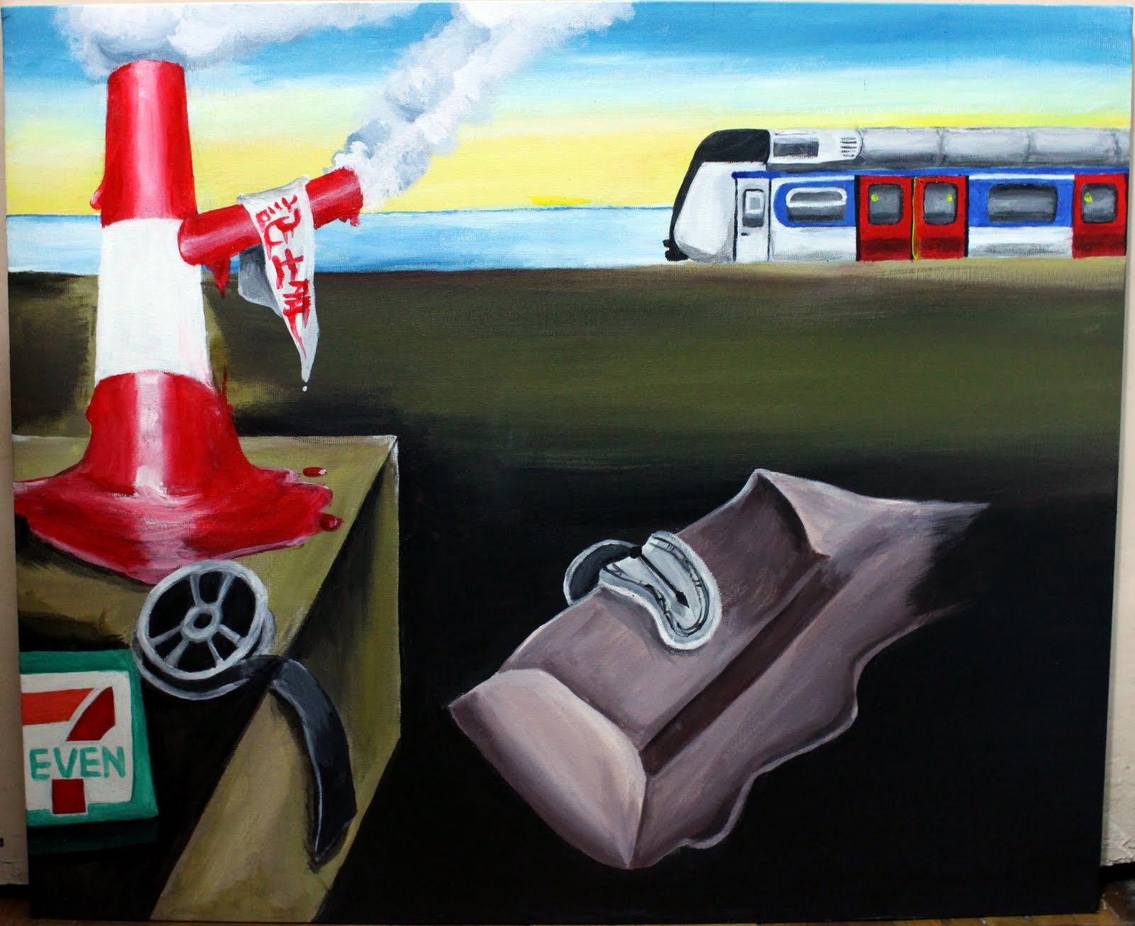
The work we have chosen to remold is a painting painted by Edvard Munch, titled The Scream. This work is painted by tempera and casein on cardboard, made at 1893, length 913mm and width 737mm. The new painting we have produced is named Xiang Gang Ren. Artists included Leung Ka Sin (Margo), Ng Man Sze (Connie), and Seung Wai Lam (William). The painting finished by 2011 is an oil pastel painting on drawing paper with length 600mm and width 205mm.

Similarly, both artworks can be categorized as Post-Impressionism, Symbolism, and Expressionism, as the works contain those criteria. On the other hand, there are several differences can be observed. Different material has been used. The original painting is finished with tempera and casein, but we used oil pastel as we keen on using this medium, believing only it could achieve our expectation. Secondly, the style is different which generally includes brushstroke, colors, composition, dimensions, etc. This is due to other differences which are about the mood and subject matter. The mood should be expressed by colors, since we have different moods, we do not share the same colors. The emotion we would like to express is not only anxiety and fears, more than that, we felt depressed, confused and hopeless. Such emotions are provoked by our theme, the oppression from capitalism. It is different from the original work which simply means to express his sudden personal feelings. We have further thought about the social context.

In the following, we choose to focus and elaborate on the categories, style and subject matter.


Categories
Our painting refers to The Scream which can be fit into Post-Impressionism, Expressionism and Symbolism. Post-Impressionism does not interest in portraying the real world objectively. In The Scream, we can see that Munch wanted to express his individual expression rather than to depict the real world. Besides, the form in Post-Impressionism always uses the visible and distinctive brushstrokes. These all could be found in The Scream.

In our painting, we use the same idea and brushstrokes with Post-Impressionism in the original work. For example, not painting a real world, mainly focusing on how our feelings are expressed. In our opinion, we are oppressed by the Hong Kong financial community and the Capitalism. Most people in Hong Kong are influenced by the turbulent economy. In order to live in a better, people are forced to cater the social economy with no ends. Hong Kong is on the top of the problem of extreme disparity between the rich and the poor in Asia. No matter how hardworking people are, they can not reach the standard point. That’s why they feel disturbed, anxious and frightened. In order to express these emotions, we decided to use the visible and distinctive brushstrokes of Post-Impressionism which can emphasize and perform the feelings in an intensive way.

For Expressionism, the art works always painted in exaggerated, unusual figures and expressive form or color to express their feelings and meanings. In The Scream, we can see that the sky and the screamer are in twisted and simplified forms. Also, the painter used red, orange and dark blue, such vivid colors to show his feelings.

The above-mentioned characteristics of Expressionism would also be seen in our work. For instances, we depicted the Hong Kong buildings in forms of vine. We also used many vivid and contrasted colors, such as orange and blue, purple and yellow, to express the intense feelings.

Symbolism works of art keep an eye on the dark side or the humanistic spirit, like anxiety and hopelessness. In the case of The Scream, it shows the anxious and fearful emotion of the Screamer that fit the characteristics of expressing the inside, surd environment. Similarly, we also use forms, colors, space to construct the state of mind including anxiety, scared, misgivings and hopelessness.
Through comparison, the differences of the forms are clearly observed.

Style
The Scream used both twisted lines and straight lines to guide the audience to appreciates’ sight to the work of art in a route, from background to the Screamer then to the men, which has a circulate cycle of view. It contained many curved lines in the sky and the sea. Also, the Screamer includes a twisted body shape. The purpose is to simplify the forms of the object which become unrealistic, and provoke a disturbed emotion. On the other hand, Munch painted the bridge on straight lines. This indicates the audience to pay attention to the men from far distance.

In Xiang Gang Ren, we mainly use curved lines and waves to construct the picture. Because using the curved lines is the best choice to perform the representations of buildings as vine and rotary. Curved lines provide a visual unbalanced to the audience, and can express the feelings of anxiety, scared and hopeless. Besides, it can make the texture like the vine and the brick as well. Finally, the curved lines guide audience to view from bottom to the top.

In terms of colors, although we used many orange, reddish, dark blue colors as same as The Scream, we put the position of colors in different directions. In The Scream, the sky mainly use orange, reddish colors and the ocean or land mainly use dark blue color ,to make a sense of psychological instability. However, we inverse to use the reddish colors on the bottom to depict the vine-like buildings, and we use dark colors to paint the well-like buildings on top. Usages of these contrast colors showed the meanings of wicked and dangerous like fire, and the ruthless and rigid like the stone of well.

Furthermore, we also added some green and yellow colors to show the variation and connection of the buildings. The grading developed a connection between the top and bottom. Additionally, those colors can make the painting to become more plentiful and dramatic.
Comparing the spaces, the space in The Scream develops in crosswise. However, our painting develops in vertical direction. We glance from middle towards surroundings horizontally when watching The Scream. On the other hand, the development of our painting is from bottom up. The wide space of The Scream developed an extend of ocean and the sky. However, we stretched the space to provide a narrow, crowded and deep space that means the Capitalism occupied our space and constrict our life.

Our visions
The original work of Munch is about expressing his anxiety and fears. Unlike Munch, we established and visualized a clearer subject matter that provokes our emotions, and Xiang Gang Ren would contain more social context. The main idea of this painting is the oppression from the upper class towards ordinary people in Hong Kong. Upper class includes the leading persons of Hong Kong which is highly materialism and consumerism.

Such inspiration came from our daily life. There was once a radio program that had invited the Financial Secretary of HKSAR, Mr. Tsang, one of the audiences phoned and told Mr. Tsang that she and her husband were not capable for a small apartment in commercial area, while they were doctors and lawyers who commonly recognized as elite professionals with high-income. Moreover, Mr. Tsang recommended them to reduce their criteria of housing choices or choose to rent rather than buy. This discourse has immediately become a hot topic for discussion within Hong Kong. The pressures and costs for a home is extraordinarily high in Hong Kong nowadays, leading the dream of owning a house becomes more difficult.

Even the government would not provide helps. Furthermore, the society keeps pushing and brainwashing working class to own a house or apartment, one significant example would be the advertisements. The advertisements usually broadcast in the golden-period on TV, brainwashing us that owning an apartment is a requirement for being respectful. More than that, they sponsored the TV station in many programs, in exchange, TV station established several programs discussing about buying a house, leaving us no room to escape from their marketing policies.

It is also essential to mention about the gap of rich and poor in Hong Kong is one of the greatest nations. Under the economic circumstances of Hong Kong, riches become richer and poor keeps being poor or worse. The upper class is empowered rapidly but the condition of working class is growing worse.

There is an issue that is equally important for discussion. Personally as an arts student, our future in Hong Kong is not optimistic, since art related career opportunities in Hong Kong are not enough for many students. The society is dominated by economy, or simply money. There are not enough places, spiritually or physically, for us to express our voices to the public. We have to sacrifice our interests for the society, for instances, many art lovers or talents were forced to enter business field to earn a living.

Our souls are represented as the “screamer” in the painting. The buildings symbolized the consuming, materialistic and capitalistic pressure. They became vines that captured and tortured our souls, not letting us to reach our sky, forming a well-like spiral, leading us to a depressed, hopeless, and insecure situation.


Conclusion
In conclusion, Xiang Gang Ren told the depressed, hopeless, and insecure situation and feelings of Hong Kong people under capitalism and consumerism. Although the only similarity is the categorization, the differences in style and subject matter made our own statement clearly.

Reference list:
Adams, Laurie. Art Across Time. Boston: McGraw-Hill, 2007.
Berger, John. Ways of Seeing. New York: Penguin, 1972.

Group Projcet: The Near Extinction of Collective Memory (by Ching, May & Macy)

VIS 104 Group Project - Research Expression
Li Hoi Ching (Ching)
Lai Mei Yu (May)
Ma Man Yee (Macy)

Title:    The Persistence of Memory
Artist    Salvador Dalí
Year     1931
Type    Oil on canvas
Dimensions     24 cm × 33 cm (9.5 in × 13 in)
Title      The Near Extinction of Collective Memory
Artist    Ching, May & Macy
Year     2011
Type    Acrylic on canvas
Dimensions     50 cm × 60 cm

The artwork that is picked and chosen to do an updated version is Salvador Dli’s The Persistence of Memory made in 1931, which is an oil painting on canvas. After the new details are incorporated into the paintings created by our project group, it became a new version of painting about present day Hong Kong. The new version of painting is titled "The Near Extinction of Collective Memory".
First, one of the similarity is the composition between both two works, the only changes are the subjects that are painted on the painting, other than that, the replaced subjects all are placed in the exact same position. Both works mainly consist of three main parts which are the left part, middle part and the background. In the original work, there is a dead tree at the left side with a melting pocket watch hung on. In the new one, it is the red and white chimney with a signboard of Hong Kong local store hung on it melting. There is a melting gold pocket in the old painting, in the new one, a camera film reel is placed on exact same spot. There is also a pocket watch covered by ants, a signboard of 7-11 convenience store is placed on that spot in new painting. Both paintings have sea that is in the exact same position. In the middle, the original painting places a melting pocket watch on a creature resembling a human face, and this new one also has a melting clock placing on a thing consisting of boat shape.
In comparison between two works’ style, there is similarity to the use of space as well. Both paintings feature an endless sea and the sky in the background, both of them successfully create a feeling of distance and give us an illusion of space. We could see the perspective is foreshortening, because we could see the objects like the dead tree and the chimney in the foreground from both different paintings that are larger than the mountain and the MTR far away, which makes viewers have an illusion that the larger one is closer to them.
            Both paintings also have similarity when it comes to subject matter, content. The original work focuses on the expression of passage of time and memory, all the melting things presented in the original painting are the pocket watch and the unknown creatures, which possibly is a representation of himself in a stage of unconsciousness since the creature resembles half of a human face with a seemingly closed eye. It means that all the things that melt are some abstract concepts exist in human’s mind, for example dream and time are concepts in human mind. Those things that don’t melt in the original painting are things that actually exist, not only in human’s consciousness or memory and they actually have physical form and stay current and constant, and the place that the painting shows is Catalonia, where Dali grew up. As the place must have meant a lot to him because of his memory.1 So possibly the whole scene represents a memory in Dali mind. Then the theme is that time is passing, signified by the melting watches, the memory will probably fade away, but the memory presents a version of Catalonia that only exists in Dali’s mind. The Catalonia that exists in physical world will remain the same, even after the memory fades away or Dali died with it. It signifies the limited time a human being can have compared to eternity of things, possibly nature. And that is the theme of the new updated version that all the things melt signifies the passage of time as they became past, as the chimney reflect the industrial and factories Hong Kong once had, but since only very few still existed in Hong Kong, and the local stores continue to decrease, also the melting boat in the middle represents the idea that our harbor is getting narrow, few boats can be seen. And what exist and stay solid right now are the likes of chain convenience stores 7-11 and the mass transit railway and the trains, it is exactly the contradiction of reality and memory.

             But there is difference when it comes to the theme that the new version has a political and social undertones to it. The original painting mainly is about Dali’s idea of time and memory reflected through his personal memory, but doesn’t necessarily reflect any social aspect. So all the things melted in the new version of the paintings don’t only represent fading time and memory, together with the solid matter, these overall represent a theme of Hong Kong’s urbanization that comes to bury Hong Kong’s collective memories that would be important to central value historically and spiritually to Hong Kong. 
For example, On the Chimney, there is a melting signboard of a traditionally local store. The Chinese character on that is “ X記士多 “ , which in English called “ X's Store”. In the past, store was very popular in Hong Kong. They would sell lots of cheap things for the people around neighborhood to share, they can buy cheap things, and the owner can make a living, they represent the idea of close bond between neighborhood. However, this kind of traditional stores are disappearing because “The Link Management Limited“ was managing the shopping mall and market of the estates in Hong Kong in 2005.2 The Link is trying to replace the traditional store into large developers' like 7-11, Parking Super Market in order to make more profit. The 7-11 sign in the left hand corner is a big contrast to the store signboard, which shows development in Hong Kong is monopolized by large developers.3 On right hand side, there is a melting boat or building, with a melting clock. Actually, this two are actually also representing a event in 2010. In 2010, the Central Star Ferry terminal and bell tower was destructed for building more buildings and roads.4 However, the Central Star Ferry terminal is historically valuable. The MTR on the right top make a contrast to these two subject matters. It represent the will of the Government-- comparing with keeping the old buildings, they are willing to build more new buildings or high-speed rail, ignoring the importance of preserving historical value.

              Finally, there is also similarity, it is that both paintings have bleak mood and a sad, depressing undertone. The dead tree in the original painting and ants on the watch give people a feeling of dying and decaying. The whole place is dark with shadow and full of space, it gives a feeling of melancholy. In the new version of painting, it also has a quality of bleakness, as the painting overall seems dark on the ground and seems to have no soul, there are only convenience store signboard, a train and the chimney. It gives the feeling of emptiness in general. “ “
            
              Overall, the new version is quite similar simply in term of the style, as it uses the style on purpose to not only express the original theme, but only the newly updated theme of Hong Kong’s social aspect.
1 Meredith Etherington-Smith: The persistence of memory : a biography of Dali (Da Capo Press, 1995), p. 411
2支持領匯上市--歷史不會忘記, 林忌, http://plastichk.blogspot.com/2009/07/blog-post_30.html (accessed Jul. 30, 2009)
3 關平 . “ 領匯公營化,Tai Kung Po Daily, Dec. 25, 2008
4 朗昕, ”Conservation gaining weight in urban renewal projects” Sing Tao Daily, Mar. 18, 2010 


Bibliography
Meredith Etherington-Smith: The persistence of memory : a biography of Dali. Da Capo Press, 1995.
支持領匯上市--歷史不會忘記“ , 林忌, http://plastichk.blogspot.com/2009/07/blog-post_30.html (accessed Jul. 30, 2009)
關平. “ 領匯公營化“,Tai Kung Po Daily, Dec. 25, 2008
朗昕. ”Conservation gaining weight in urban renewal projects” Sing Tao Daily, Mar. 18, 2010
 

Group Presentation Project, by Water and Deja


Original Artwork
Artist: Pablo Picasso 
Year:1903
Media: Oil on panel
Dimensions: 122.9 cm × 82.6 cm


New Creation
Artist: Water and Deja
Year: 2011
Media: Mix-media (Watercolor painting and digital Photoshop)
Dimensions:  42 cm × 29.7 cm


From “The Old Guitarist” to “Uniped Artist at Central”
by Water KWONG Ka Ming and Deja Chenyang DU

This essay is based on the research expression group project in which a “Hong Kong update” of Picasso’s Old Guitarist is created, namely the Uniped Guitarist at Central. Largely inspired by the Old Guitarist, we try to reflect our re-observation of the phenomena in Hong Kong through symbolist aesthetic. The Uniped Artist at Central is highly consistent with the Old Guitarist in the melancholy state of mind expressed mainly by the mood-creating color. However, we had made a variation in terms of the subject matter, the medium and the style. And the essay will disscuss in details in the following focused areas: subject matter, composition, color and medium.

First of all, the subject matter we depict is attributed with a multi-layered identity. Unlike the old guitarist, he is disabled at the same time, with his right leg gone. Here he is, at the corner of a wall, sitting on the ground, prosthesis fallen, contrasting with the undamaged bended left leg in front of which it lies, roughly in parallels, symbolizing the unsheltered vulnerability. The vulnerability is also illustrated as his left foot is bared whereas ironically the fallen prosthesis on the ground has one on. No human would be willing to expose one’s weakness and pain to the strangers on the street. How much he must have been struggled to bear people’s eyes glancing over his damaged body with pity, scares, and despise. But he needs to do that as a common manifestation by the disabled street mendicants as if saying, “See? I am not faking it”, in order to make a living. Unlike the old guitarist, he sits straightly on his back, with his hair neatly cut and shirts clean. If we focus at his upper body, we would probably think he is any different from other young artist who actually likes to perform on the street more. The contrasting of the upper and lower part of body symbolizes the cruelty of the real world where people tend to only identify and label you based on what they see on the surface and most often by amplifying your weakness. It seems doesn’t matter much how elegantly his long and slim fingers move flexibly and how he is immersed in his music, he is still an uniped street guitarist after all, who belongs to the little corner at the wall. His guitar stretches out of the wall into the space on the right symbolizing his latent yearn towards the “outside world” which will be explained more detailed later in the essay. The guitar is aligned with the direction of the disabled leg, supplementing his disability and even extending as an extra limb of his body. The facial expression of the young artist is not as melancholy as the old guitarist, but similarly with eyes closed. He is probably immersed in the lyrical guitar melody, and by closing the eyes, all the material reality is closed out, his damaged leg and prosthesis that constantly remind him of great misery could not be seen. As eyes closed, purity and peace inside the mind achieved, temporarily, at the moment.

Together with the change in subject matter, we give Uiped Artist at Central a different composition. In the Old Guitarist, Picasso casts the subject matter with the whole attention where this old man occupies the whole canvas, even kind of squeezes into the spaces. Our uniped artist is sitting at the corner of the wall which takes around one third of the canvas, and is kind of pushed to the corner of the left bottom. The wall is surrounded by skyscrapers that occupy the rest of the space, causing some sort of tension and pressure to the space where our artist settles. The wall now looks like a strong and protective shelter, supporting up the space the uniped artist need. But the blurry edge of the wall and the surroundings suggests the intruding erosion from the material world. What is interesting is that we can only see the modernity through the setting of the background of skyscrapers, huge advertisement of digital products, and commercialized square promotion activity; there is no sign of ages by looking at the artist. The composition also shows our focus of the inward focus of the subject matter, though compared to the Old Guitarist, our work is more balanced in terms of providing a detailed background setting, making it specifically apply to Hong Kong, where arts are under-appreciated and led by the commercialized functions, materialism pervades and the disadvantaged group unprotected and edged by the society.

Moreover, consistently using the cold and dark color, blue and black to express the somber mood. Also, we do make some difference in the medium we use. The subject matter and the left corner are water painted, different from the oil painting of the Old Guitarist. The background is the central street view photo, and it is edited by Photoshop to transform into the watercolor painting to fit the style. The work is combined these two different media into one with the computer, Photoshop, and we edited it, use some effect to make the painting style consistent with the harmony mood.   

In conclusion, Uniped Artist at Central mainly expresses the struggle of the disadvantaged group and the struggle and persistence as an artist in the materialism driven society. Our main claim is especially illustrated through symbolizing the subject matter and depicting the interrelationship between the subject matter and the surroundings. 

Group Project

Transform ''Les Demoiselles d'Avignon'' to new artwork ''Hong Kong Girls''


Artist :Pablo Piccaso
Year:1907
Type:Oil on canvas
Dimensions:243.9 cm × 233.7 cm (96 in × 92 in)
Artist :Dora Lui
          Edith Lam
         Kitman Leung
Type: Water Painting
Title: Hong Kong Girls


Transform ''Les Demoiselles d'Avignon'' to new artwork ''Hong Kong Girls''
The original work is Les Demoiselles d'Avignon originally titled The Brothel of Avignon. It is a large oil painting of 1907painted by Picasso (1881–1973). And our work is Hong Kong Girls. Hong Kong Girls is a new terms those HK males describing girls in Hong Kong. Basically, the complaint is that girls in Hong Kong are money-greedy, too emphasize on out looking, weight-obsessive and have unreasonably high expectations for guys. This painting is not complaining Hong Kong girls, but describing the difficulty of being a girl in Hong Kong. We chose this painting because the main subject is girls and the girls in the painting is describing in a confident way. Confident seem a suitable word to describe Hong Kong girls but the confidence not come from themselves, it come from other external factors. We will go deep on five important similarities and differences between the two works; they are subject matter, style, composition, color and tone.
The new artwork has a great contrast than the original one as the usage of the color, the material and the brushstroke.
   Firstly, we use the makers to depict the shadow of those women, in order to highlight the shade of the women and make the work much more iron. Moreover, the usage of markers commonly used to draw the scrawl, so it can make the artwork easier to contrast with the nude women and main ideas of iron Hong Kong Girl. Compare with the original one, the original one only use oil material to depict the artwork .The contradiction made between the artwork and the ideas seem not enough.

   When it comes to the color, there come to different between these two artworks .The new artwork, we can find that there are not only blue or cold color at all. But also depict by some warm color such as the pink or the peaceful green, which make the painting much more vivid and peacefully to read.   But the original only cold and dark in tone which the artwork make you feeling sad .This also made the work too consistent , in order to depict that the diversify life in Hong Kong we use some sharp colors to depict this symbol .

  Compare with the original artwork and the new one, the rhythm of the original is consistent and evenly, but the new artwork seem that it is random and seem not organized. You can find that apart from the oil material , we cut and paste the bags , the teen model and the technology in this painting , it seems that it makes the artwork seem messy , but this also can emphasis the characters  of the Hong Kong Girl , for example pursuit of the brand name products , teens model est. and the original artwork , the nude women and the background do really seem to have a well organization and consistent,Moreover the line is also in order  , but the main idea of this artwork still been not yet emphasized by Picasso , as we can see he only put the model evenly in the painting .

   Moreover, the brushstroke of the new artwork different than the original one. At the new artwork, we put the brushstroke without any organized and seem messy. But the brushstroke of Picasso of his artwork does look neatly also.

  When it comes to subject matters , the original artwork separate the women into parts , the first party depict of the African-life mask model and another party depict the Liberian style of the Spanish , but the new artwork separated the women into three parts , the woman in the left represent the women in Hong Kong pursuit of the slim , and the woman who are hopping up representing the Women in Hong Kong like to look strong and better than the men .Moreover , the right hand side of the woman is a teen model who are in a hot issue in Hong Kong nowadays and finally the subject which is on the bottom , which represent that the women in Hong Kong also like to pursuit the development of the technology . In sum up, we can find that the new artwork seem to have much detailed depict of the character of the women.


Next, we will talk about the similarities between two works. It will be separated as five parts-- subject matter, style, composition, color and tone.
First, the subject matter of two works is also female. The original work of Picasso is presenting unconventionally feminine. Their body shapes are distorted and angular. This point is matched with our own work. The girls are with angular body and distorted proportion and unusual face. Also, Picasso emphasize that they are young ladies.(the English of the title is "The Young Ladies of Avignon") Our work is also about young ladies but in Hong Kong. Our work's subject matter is about the difficulties of being Hong Kong girls. One more point is that two works express the same idea-- feminism. They both want to reflect the social phenomenon.
Second, the similarities of style are that they are the same feeling. Two works are use straight and rough lines. The lines of ladies' body are in same style. They are angular and also display different angles. Out work also use the style of Guernica.
Third, the composition is similar. Picasso described five nude female figures. Our work also portrays five figures. The position is similar too. Two ladies in left side, one in the center, and one at the back of the right side and one in the front of right side too. The five ladies appear in the painting averagely in two works. Their size is similar. They show almost the whole body in the painting. Their level of two works is also similar. The three ladies in left and center are on similar level. And the back of right side is in the highest level when the front one at right is the lowest.  The rough composition is the same in two works.
Forth, the similarities of color in two works are comparatively little. The background is similar when they also use brown, grey and blue. Not only the color but the composition of the background is the same. Also, they use nude color on the nude bodies (some are not in our work). The texture of color is similar. They are rough and hard and near with nature.
Last, one of the similarities of tone is about the faces of the figures. Look at the ladies' facial expression, it is so alike. The tone is moody and a little bit sad. Their face are doleful and without strong emotion. So, the whole tone of the works is identical.
To sum up, we want to change the original work Les Demoiselles d'Avignon to present the feature of nowadays girl in Hong Kong. They seem confident as the girls painted in the original work, but Hong Kong girl needs some external factors to build up the confidence. Therefore, two types of girls in two paintings are different as one is nude and another one are adding a lot of external factors.
 By Dora Lui (1148469)
      Editha Lam(1101148)
      Kitman Leung (1183328)

Transform "Marxism will give health to the sick" to "Self/Save" by Frieda Luk, Verna Kai and Sisi Kam

    
Marxism Will Give Health to the Sick         
Artist: Frida Kahlo                                             
Year: 1954
Medium:Oil on panel                                                                           
Dimensions: 28.8 x 23.8 in. / 73 x 60 cm


Self/Save 
Artist: Verna Kai, Frieda Luk, Sisi Kam 
Year: 2011
Medium: Acrylic
Dimensions:  21cm X29.7cm


Chosen Frida Kahlo’s “Marxism will give health to the sick” is base on our desire to through produce an art work to document our lifetime, our dream and our situation in Hong Kong. We named ours “Self/Save“. Similar to Frida, we want to establish and re-assure our identity through art (the motivation). At the same time, the composition and use of icon are quite similar. However, the medium, the mood and the subject matter are different. 
In order to discuss “Marxism” and “Self” in details, rather discuss it in separate sphere we would like to combine to three main areas: subject matter, style and mood.


Starting from subject matter, we would describe it as “the similar motivation but different in message”. From the very beginning, we have no intention in painting a portrait; instead we choose to create a self-expressive iconic painting. Unlike Kahlo, she painted a clear and recognizable portrait at the center and with clear symbolic colors (red book-Marxism rule, green and white dress) that indicate her Mexican identity. We choose to paint a figure that would represent three of us. Actually, the figure we paint is the situation that we are now. The white dress worn by the figure is embodied with white flowers, and is much shorter than Frida’s one. Here, we are stating that unlike Kahlo, from physical and mental, there is no unbearable pain within three of us. Showing our body would be easy. However, the figure is without a facial structure. It is with ambiguous features. This symbolizes we still in search of who we are. The white flower, at one side, is representing our purity which we still clean and naive as a baby. At the other side, it is a way to express our femininity. We treasure being as a female and want to protect our identity to its genuineness and originality. 

Who is the savior and who is the devil in “Self” are both ourselves which is distinct from Kahlo’s one. That means our work does not consist any political messages. What we express is how we struggle through our own lust and desire for materialism in order to survive in a profit-oriented society (indicated by the crowded infrastructure and buildings at the bottom right hand side). We believe only ourselves can save ourselves. In “Marxism”, there is a clear political stance and message that is only Marxism can save Mexico from poverty and social in-harmonious. As Frida has wrote: "Peace on Earth so the Marxist Science may Save the Sick and Those Oppressed by Criminal Yankee Capitalism". Yet, we still believe in the wisdom of eye. That makes us and Kahlo a similarity in being protected and saved by wisdom. And, that is what we expect one day we can achieve. 

Like Kahlo, we have the intention in re-establishing our identity in our work too. Also, we focus on our individual expression more than anything. We use painting as a way to document the status of mind in the year of 2011. Same as Frida, she documented her mental status and thought into “Marxism”. Her enthusiasm in joining protest and movement held by Marxism integrated into the painting too. 

Following, we would like to move on analyzing the similarity and differences in style. Before analyze the style, we would first point out some main points: similarity are composition, iconographic and use of space; differences are color, tone, brushstrokes and medium. These similarity and differences are clear and obvious. Even so, from our perspective, we do believe we have integrated characteristic of the Vernacular Modernism which is dialectic and with recognizable regional style. At the same time, the piece is enriched with individualistic style. Frida’s “Marxism” (more precisely is most of her paintings) is influenced by Retablos and Ex-votos which means her work are in vibrant color, iconographic, reveal directness of emotion, vivid and simplified forms and dramatic contrast. In “Marxism”, we can clearly see the trait. Firstly, is iconographic: The Marxism man, the eagle (capitalism), the dove (peaceful), the red book (Marxism rule), the mushroom-like explosion (atomic bomb), the green-white dress with the red book (Mexico flag) and so on. Secondly is the intense color: red and green, orange tone skin and blue sky are with great contrast. Thirdly is the rough, harsh and heavy brushstroke. These are revealing her immense passion for the Marxism ideology and her eagerness to get rid of the physical and mental pain caused by years. Now, we can learn how Frida’s work being described as Vernacular Modernism.

To recreate the artwork with an altar in subject matter and style, the result is that the composition, iconographic and use of space we chose to follow Frida’s “Marxism”. Since we hope when people approach to our work they can immediately think of “Marxism” and be reminded the emotion of release and being saved. As a result, (we picture that) it helps us to intensify the struggle we faced in nowadays Hong Kong and the huge expectation we put on ourselves (we can save ourselves from a financial-dominated society). As “Marxism”, the background is horizontally divided into sky and earth. Also, the earth is vertically divided into destructed land (right) and meadow (left). The blurred face figure representing us is placed in the middle. The scene which is the clear face figure and the girl with mask being clutched is placed on the right hand side to represent how we struggle to get rid of succumbing to the reality. The use of space is also as spontaneous as Frida’s. The senses of spaced is not clear. There is no sense of three dimensions. On the other hand, our work is full of iconic image. For instances, the explosion of buildings represents the real estate domination in Hong Kong; the sun represents hope; the white flower represent purity and the all-over coins represent abandoning the profit-making lust.

Moreover, we make some differences in color, tone, brushstrokes and medium. The color is more soft and coherence, not that vibrant. The tone is more tuned down, earthier. We would like to describe the brushstrokes and medium more. For the brushstrokes, overall there are lesser lines and trait. Mostly are plain and smooth areas of color. However, at the left hand side we integrated Van Gogh impressionism style in drawing “Starry Night” into our sky and meadow. It is because we want to express the dreamy and un-realistic feeling which represents our pursuit in one’s passion. More importantly, the medium is quite opposite. We choose to create something similar to collage. We painted the figures and symbol on a paper and cut it out and stick it onto the background so as to create a sticker-book like vision. This represents how we try to fit into the society without abandoning our own pursuit. At the same time, we stick our painting onto a brick-wall randomly on street and painted “Who save us!” on the wall. 

The painting is the answer: only we can! To place our artwork onto the wall is mingled with Hong Kong popular art form: street art. This can help us re-establish our identity.

Last but not least, the mood overall is soften than Kahlo’s one. The color use is not that intense; the style we chose is milder; the subject matter without political statement is not serious. 


In conclusion, we are inspired by frida’s artwork and we recreated it to suit our own purpose, which is to express our concern on nowadays Hong Kong. Actually, we are really enjoy on doing the project because we can practice our skills and express our ideas to the others. Even the project was finished, we won’t forget the memory that we have.


By (Animal Mask)
    Kam Wan Sze
    Kai Yuen
    Luk Shao Shin
    

Group project

Comparing “The Old Guitarist” and “The Crazy Otaku


Minnie Cheng Mei Ling
Venus Li Ka Ching
Jimmy Li Kam Fung


Artist: Pablo Picasso
Year:1903
Media: Oil on panel
Dimensions: 122.9 cm × 82.6 cm


Artist: Venus Li, Minnie Cheng, Jimmy Li
Year:2011
Media: Water colour painting
Dimensions: 26.5 cm × 18.5 cm


The original work that we have chosen is “The Old Guitarist” painted by Pablo Picasso in the year of 1903. And the title of our own work is called “The Crazy Otaku”. The similarities between the original work and our own work are the composition, the perspective and the colour tone. And the differences are the subject matter, the medium and the message brought by the painting. For the composition, both include a man who is holding an object. Also, both use similar colour tone, there are only two contrasted colours used in the paintings, blue and brown for the “The Old Guitarist”, green and pink for “The Crazy Otaku”, the colours used are monochromatic. And for the difference in medium, the original work is an oil painting but in our own work we use water-colour.

In the following essay, we would like to focus on the composition, subject matter and the message brought by the paintings. Firstly, the composition of the two paintings is similar. The perspective of depicting the paintings is similar that the men and the objects held by them occupied the largest area of the painting. Both men are sitting on the floor with the head looking downward and holding an object with the same posture. Also, the objects of the two paintings that are the guitar of the original work and the Lang mo cushion held by the otaku are also facing the audience.

In addition, the subject matter of the two paintings is different. For the original work, “The Old Guitarist”, there is an old, blind, pale man with shabby clothing weakly sits beside his guitar. But for our own work, “The Crazy Otaku”, there is a crazy otaku with glasses holding his Lang mo cushion with 1:1 size tightly. “Otaku” is originally a Japanese term used to refer to people with obsessive interests, particularly anime, manga, or video games as defined by Wikipedia, and it is also widely used in Hong Kong to describe those men who are crazy for the Pseudo-models or Lang mos. Lang mo is a Cantonese slang term used to describe a type of models in Hong Kong who appeared in the late 2000s, and became popular in Hong Kong in 2009. Lang mos refer to young “models” with no professional model’s training and who do not have the fit bodies to perform high fashion catwalk, as they do not have a minimum height of 5'9". Lang mos usually work as promotional models at fairs and expositions. They often attract media and otaku by welcoming photo-taking of their beauty and body figures.

Furthermore, the message brought by the two paintings is different. For “The Old Guitarist”, the soft and mixed blue palette highlights a tragic and sorrowful feeling. The guitarist is nearly dead, representing that he is not so satisfied with the world. Simplified details and elongated proportions are found to emphasize his quiet meditation and a sense of spirituality. Moreover, the dull brown guitar fills up the area around the guitarist in both symbolical and physical ways. It is also the center and focus. The guitar indicates the guitarist's isolated world and the only wish to survive. A guitar, as a musical instrument, is a natural mean for expressing emotions so this allows the guitarist to share his loneliness. Some art historians believe this painting expresses the lonely life of an artist and the automatic struggles that are brought by the profession. Therefore, music, or art, comes as a burden and a dividing drive, isolating artists from the rest of the world. Art itself is a symbol of rejection and solitude. Although the old man is as poor as Picasso that they could even hardly make a living, they still continue to pursue their hobby, playing music and painting respectively. It implies that what Picasso chases for his whole life is something spiritual and intangible.

However, the message brought by our own painting “The Crazy Otaku” is about the present day Hong Kong. In these days, there are lots of Otaku who are crazy for the Lang mos. They only focus on their Lang mo idols and go to all of their functions. Those otaku will buy the sexy items of their Lang mo idols, just like the cushion with 1:1 size, bikini’s photos and photos album, etc. Those models are usually beautiful with good body figures, they become a kind of wish-fulfillment for the otaku as most otaku are those who are not good at communication and socializing, they are afraid of making friends with girls, so they have to buy the 1:1 sized-cushions to fulfill their wish of holding a girl and have the sexual imagination. We painted “The Crazy Otaku” not only for criticizing the unhealthy situation of those Otaku but also the Lang mo in Hong Kong. Many of them have now issued 'albums' which are launched at book fairs and sold at newsstands. These have been generally criticized as 'low-class' and 'inappropriate'. A famous social critic Chip Tsao, said: "allowing these vulgar photo books to be sold in the book fair reflects a wide spread of stupidity in Hong Kong." Also, they appeared in the annual Hong Kong Book Fair and signed for their album, this caused a media stir and a chaos of otaku. Therefore, our own work “The Crazy Otaku” probably shows the phenomenon of otaku and Lang mo in Hong Kong nowadays.

In conclusion, “The Crazy Otaku” is a work criticizing the corrupt condition of the otaku and the Lang mos in Hong Kong. We think that Hong Kong people should not provoke the harmful trend of the Lang mos as they twist the original nature of models’ career and affect the attitude of teenagers towards money since Lang mos give a wrong concept for them that they can earn money in that easy way by showing off their body with scanty clothes. Instead, we should face this problem squarely and stop the prosperity of Lang mos’ business in order to help those otaku to return to society.


References:

“Pseudo-model – Wikipedia, the free encyclopedia”


“Otaku – Wikipedia, the free encyclopedia” 

http://en.wikipedia.org/wiki/Otaku (accessed Apr. 14, 2011).


“The Old Guitarist – Wikipedia, the free encyclopedia”